Portfolio
Vision 2020
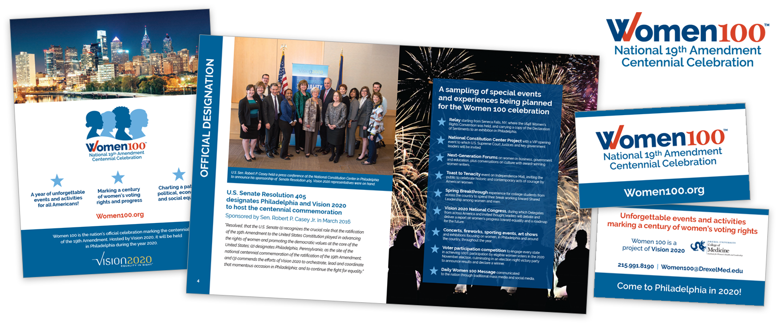
Vision 2020 is a women’s equality initiative to bring awareness and change toward gender equality. Women 100 is the year-long celebration of the 100th anniversary of the 19th Amendment, which granted women the right to vote.
Vision 2020 came to us to help brand and market this historic celebration. We began with design of the Women 100 logo. We gave it a patriotic color scheme and extended the right side of the W to suggest a checkmark. The other graphic elements were created to cupport the logo and reflect some of Vision 2020’s original branding.
We then worked with Vision 2020 to deign an inviting overview booklet that would be used to gather support and donations.
How to Start a Charter School
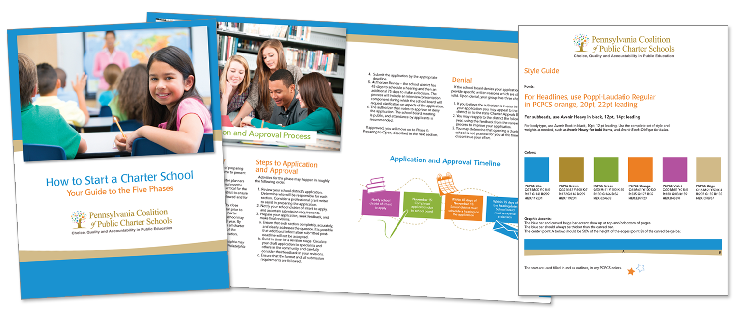
The Pennsylvania Coalition of Public Charter Schools (PCPCS) advocates for and promotes the public charter school movement by establishing working relationships with other education reform organizations, professional organizations and government agencies seeking to improve the quantity and quality of educational choices for parents.
PCPCS came to us to develop a booklet to help explain the detailed process of an organization becoming a charter school. We picked up the bright colors and icon style from their logo and fleshed out a handsome and easy to understand guide. They already had a logo, but were in need of expanded branding, so once this booklet was done, we created branding guidelines based on the project we just completed.
Family Support Line and the Delaware County Children’s Advocacy Center
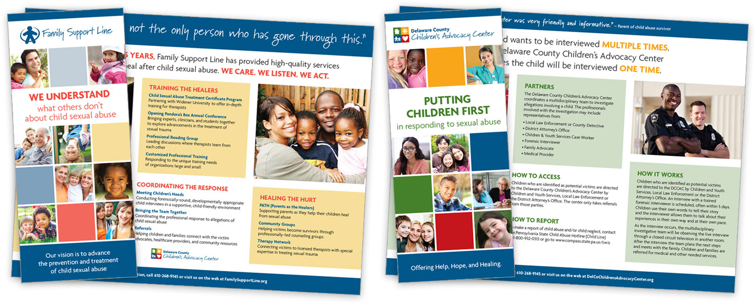
Family Support Line is the only organization in Delaware County that tackles the important and difficult task of advocating for the prevention of child sexual abuse. They provide workshops for local agencies and are a safe place for the needed support after the experiencing the trauma of child sexual abuse.
They recently opened the Delaware Country Children’s Advocacy center, which is the location at which they provide these services. With the opening of the center, they needed a new logo and marketing materials. We came up with a look that was a close cousin to their current branding, but different enough to stand on it’s own. This look was then applied to business cards, brochures, a website and other marketing materials.
Agora Cyber Charter Schools
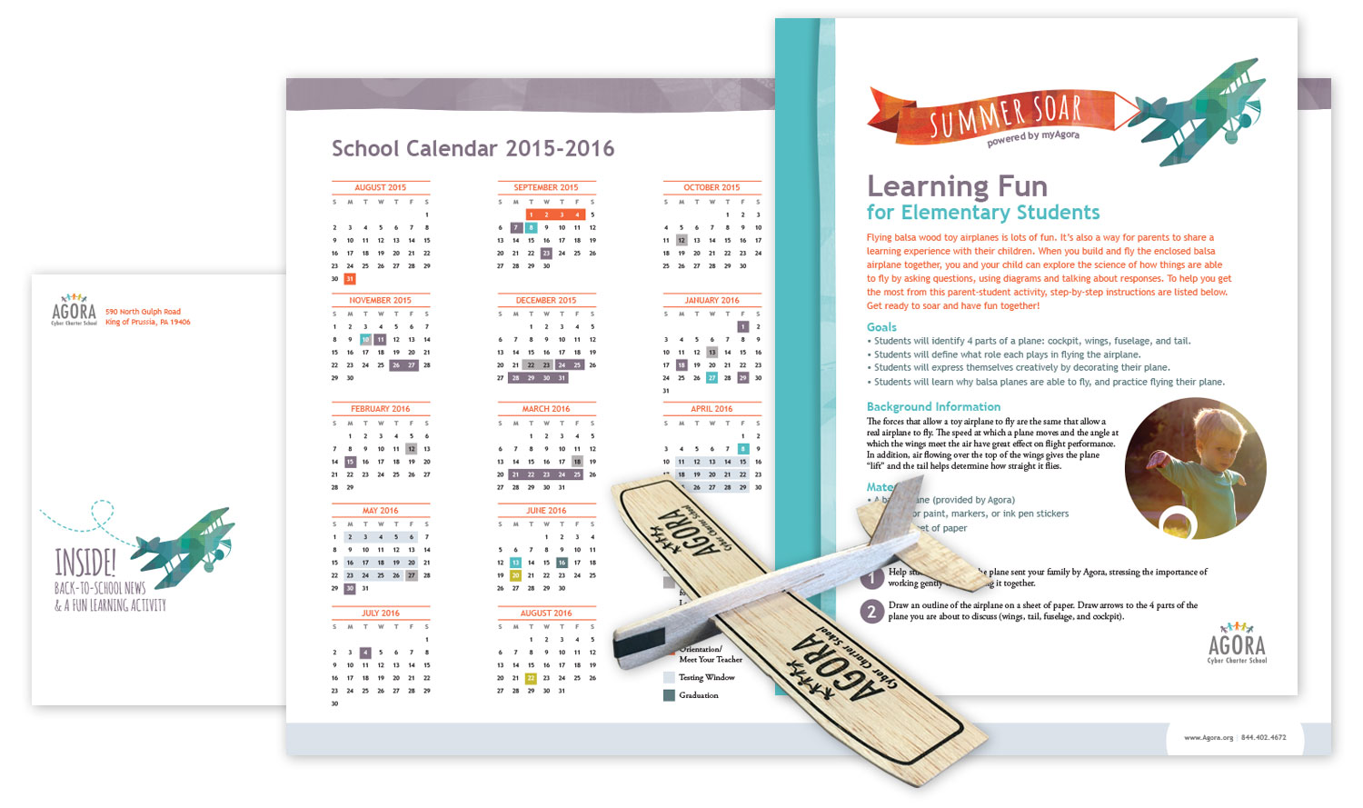
Agora Cyber Charter School wanted to get students excited about the start of school during the summer break as well as provide important back-to-school information. They decided to mail out a packet with a balsa wood airplane, thinking that would be cost effective and fun for the kids.
We named the packet “Summer Soar” and designed the logo that appeared on the outer envelope and on all of the interior pieces. We then wrote a four-page newsletter, and several activity sheets to go along with the plane theme. The end result was a beautiful and engaging packet that was very well received by the Agora Board of Directors and students alike.
Mastery Charter Schools Newsletter
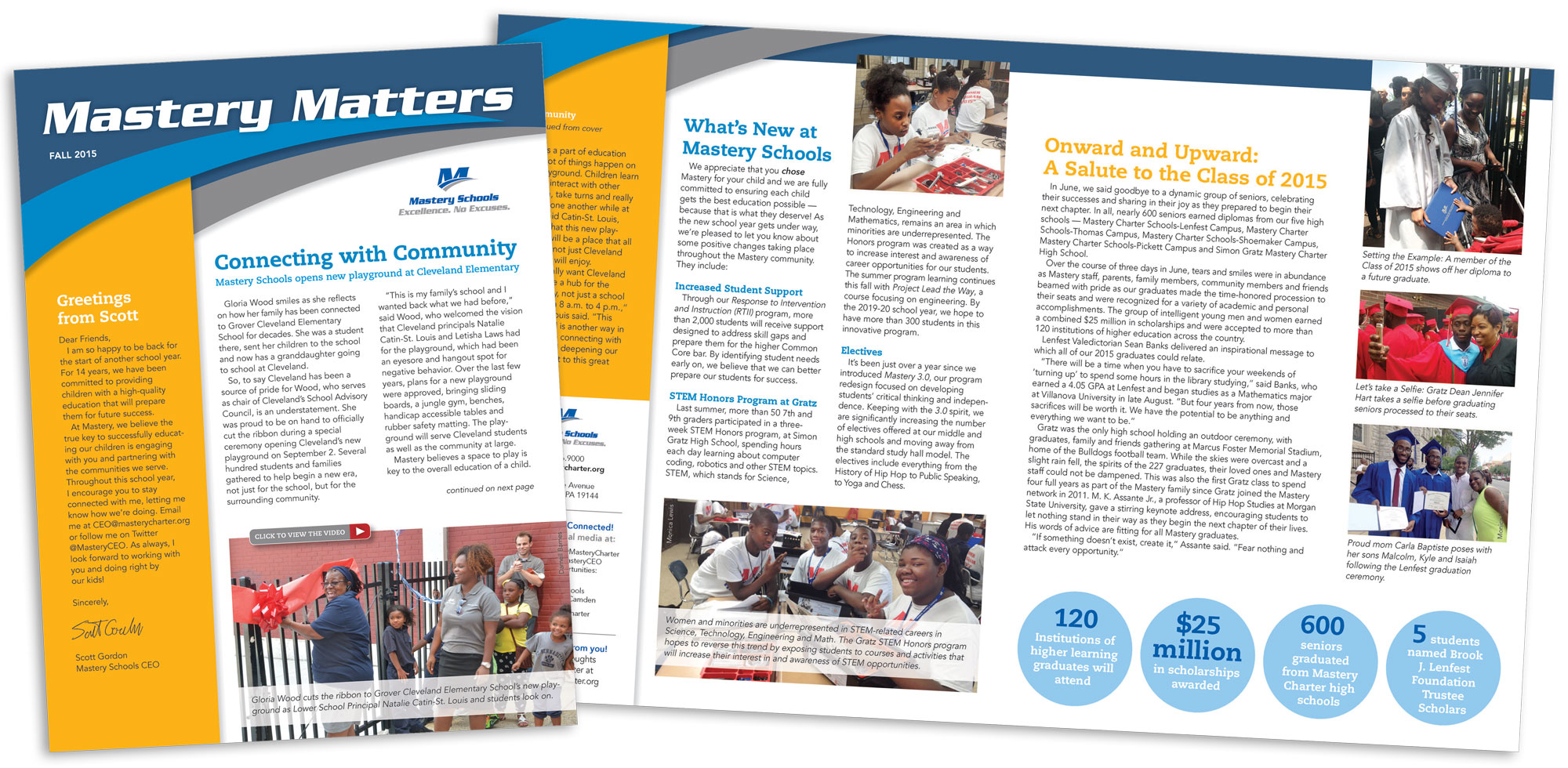
Mastery Charter Schools of Philadelphia wanted to mail a newsletter to their community members and their staff. They also asked us to refresh the Mastery brand to make it more inviting and modern.
We achieved this by blending a bit of the old look in with the new, so it wasn’t a total shock to people who knew and loved the brand. We kept the main Mastery blue, but added some more sophisticated accent colors to polish it up and chose friendly fonts to engage the reader.
Once this look was approved, we applied this new branding to many other projects for them including flyers, fact sheets, advertisements and social media graphics.
Kirby Bates Associates
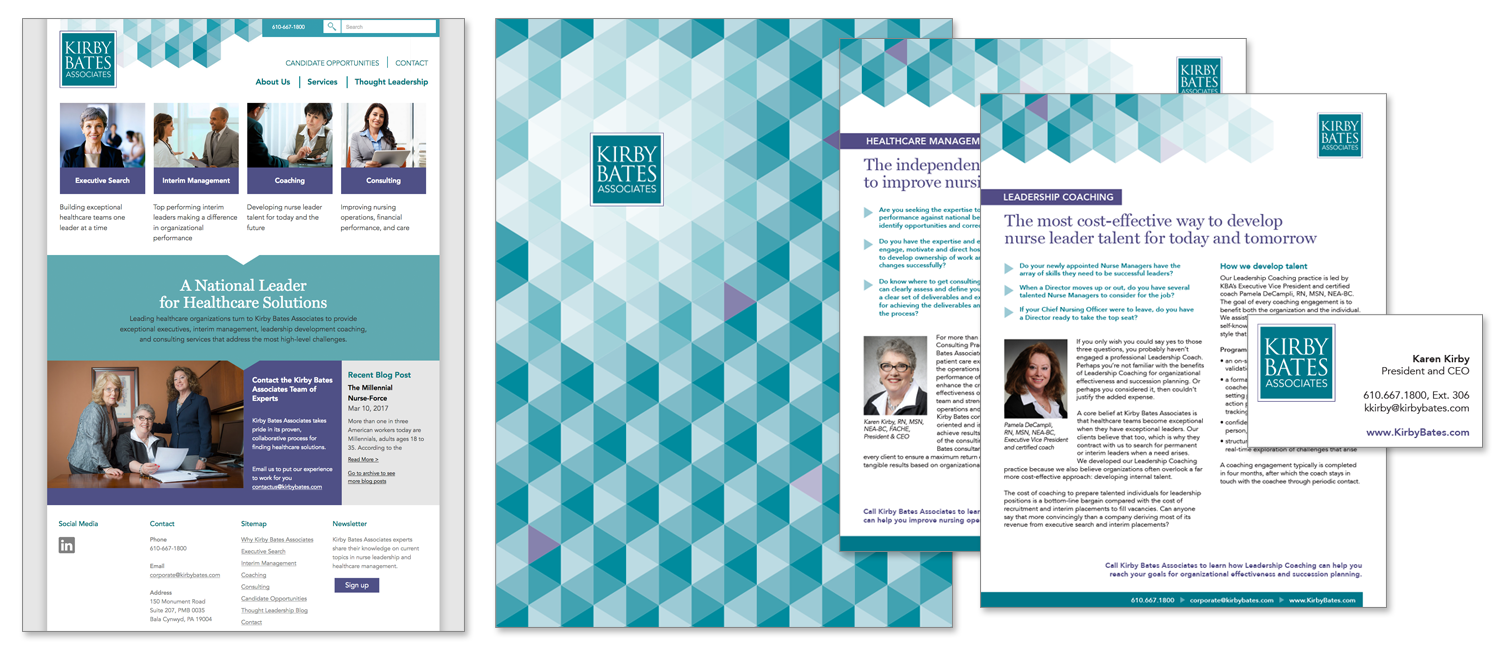
Kirby Bates came to us seeking a fresh new look. They wanted something more modern, unique and clean-looking. We began with their logo and slightly tweaked it to improve the readability. We then used that and the client’s input to build out visual identity from there.
What we developed was a totally custom brand of hexagonal shapes in different shades of the Kirby Bates turquoise. We decided to keep their deep purple as the accent color, creating a slightly feminine look for the woman-owned business.
In the end, we applied the new look to a marketing folder, several flyers, business cards and lastly, their website.
Freedom Massage
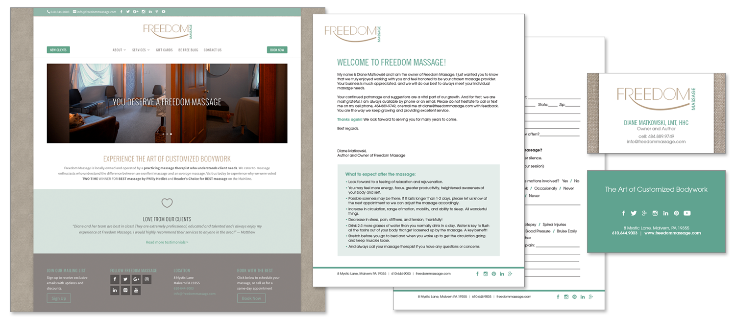
Diane Matkowski, owner of Freedom Massage, built her company from the ground up and had done a successful job at branding herself and her company for many years. But when she decided it was time for a refresh, she came to me to take the look in a new direction.
We came up with a modified color scheme that was much calmer than the previous lime green. It was soothing and peaceful, much like the massage studio she practices in. I created new business cards, letterhead, postcards, and then finally a brand new website. In addition to the new look, I reorganized the website and made it much more user friendly and mobile responsive.
